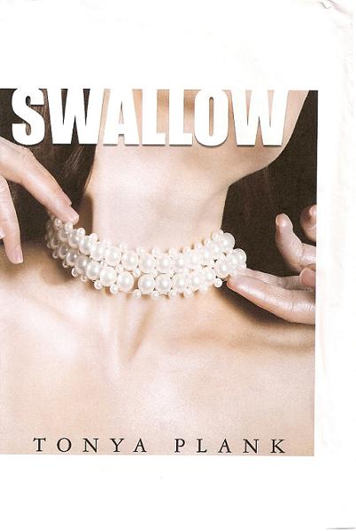
Sorry posting has been kind of lame over the past week. I’m working really hard on finishing the final read-throughs of my novel and, as always, it’s more involved than I expected. I have several exciting Fall For Dance programs still to write about — a puppet-performed Petrushka, Bronislava Nijinska’s Les Biches, the fabulous Trocks, Dance Brazil’s unique capoeira / samba / modern blend, Tiler and Gonzalo 😀 , the best Afternoon of a Faun (involving two fauns actually) I’ve ever seen — this is by far the best FFD Festival I can remember — and I plan to write about it all at the end of the weekend or early next week; after, hopefully, I’ve finished my rewrites.
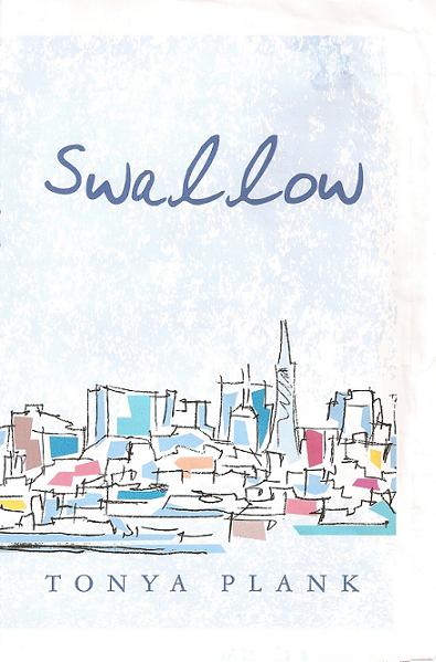
In the meantime, above is my final cover. Took me forever to okay something I was happy with. At first I was going to go with this one:

But then I had dinner with a gay male friend, who said of this bottom one, “Okay. This looks like it’s about a girl who goes around New York giving blow jobs.”
Which my novel is NOT about! I sought others’ opinions — nearly drove all of my friends crazy — and most people agreed that, since it’s about a young woman with a disorder, the cover should indicate that. It’s just that the disorder she develops is due in part to her moving into the city — a city she feels largely alienated by — and so it’s partly about her ability to make her own home here. Which is why I thought an arty cityscape would work.
But apparently not with this title!

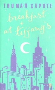
I’d gotten the idea for the arty cityscape cover from my favorite Breakfast at Tiffany’s edition.
I also love this cover, for Charles Jackson’s The Lost Weekend:

This is as large as I could blow it up, but it’s one of my very favorite covers. I’d asked my design team to come up with something similar (with a woman looking into the abyss), and they couldn’t. I showed a friend and she kind of burst out laughing and told me I’d need to hire an artist to make me something wholly original if I wanted something approaching it. I have that Lost Weekend edition (which I found at a rare bookstore in Durham, NC) and the cover is an actual piece art — it’s actually painted onto the cover, which is made of a sturdier material than regular covers — the result being that once the years go by and the cover ages, you literally can’t open the book without breaking it. So, the irony is that that book is unreadable; it must simply sit on my bookshelf facing out, to showcase the piece of visual art that it’s now solely become. In any event, even if I did want a book that could only be enjoyed for its cover, I don’t have the money to hire my own artist.
But I think my design team came up with something that works anyway.
My biggest problem with having a photo of a woman on the cover is that I was afraid it’d be taken for Chick-lit, a moniker I think every female writer has some kind of issue with, or at least thinks about. I thought an illustration would make it look like it’s about art — which it partly is: one of the protagonist’s friends is an artist and he’s an important character. And I thought a photo of a woman would alienate male readers. But then a friend who works as an artistic director of a magazine said illustrations don’t sell; you gotta have a photo, which she insisted was pertinent to books as well as magazines (and she has two published books of her own out). She’s one of four or five people (as I said, I drove all of my friends stark raving nuts) who helped me come up with the idea for my final cover.
…which I’m happy with — I think it hints at what the book is about and is dramatic and somewhat provocative without being over the top. I just hope it doesn’t alienate potential male readers. But then, as practically everyone I know (of both sexes) have told me ad nauseam, men don’t read anyway — especially fiction; women read and Chick-lit sells. So just embrace it.
Anyway, there are many other issues involved in the whole Chick-lit quandary, and in book cover art, but I’ve blabbered for too long. Have to get back to my rewrites… And I need to go out for my Friday cupcake.
Have a good weekend everyone!


Well, not to be too crude, but I think just the title, “Swallow,” is enough to make you think of blowjobs, isn't it? I don't know much about your book, but isn't there something a little less…apt to be used as a double entendre that you could use?
I like the cover you went with. I like it very much!
Thank you Erin!
Congrats on choosing a final cover! Can't wait to read it when it's out 🙂
I want an autographed copy! How do I get one?
I hate to be even cruder, but the pearl necklace doesn't help. People are going to assume something about this book that I know you aren't going for with the story but that could help push product!
I can't wait to read your book!
I agree, the term “pearl necklace” is immediately what came to mind for me especially with the title Swallow. Sorry, but you might want to think about this if it's not too late. If I saw this in a bookstore that is what I would assume and not even pick up the book, though I am sure a lot of people will for that reason alone.
Thanks so much for your support you guys! I'll definitely keep you updated and tell you when it's out, SanderO, Taylor and Joanna. Liz, Benita and Stitches — thanks for your interpretation. I had to look it up because I couldn't figure out what you meant :S I don't want to say what exactly I meant by the cover and the title because I think when writers do that it's kind of cheating, but I meant them to work on a few different levels. I guess it could work on one other level as well. And yes, Liz, there are several things that I intended to have double or triple meanings.
Anyway, thanks for your input you guys!
I think it's perfect. Congratulations!
Thank you Sandi!
Thank you Sandi!